Date: Fall 2017 - Spring 2018
Project: Inclass Industry Partner
Team: Ezgi, Ray, Yuan, Soham, Sogar
Skills: Design Research, Wireframes, Mobile UI
1. Self-observation
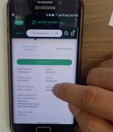
In order to better understand the current experience of grocery shopping, we conducted an individual observation activity and documented the shopping for food experience. This step helps us to identify the various stimuli and steps needed to shop for, decide on and buy food.Here is the report of my self-observation activity.
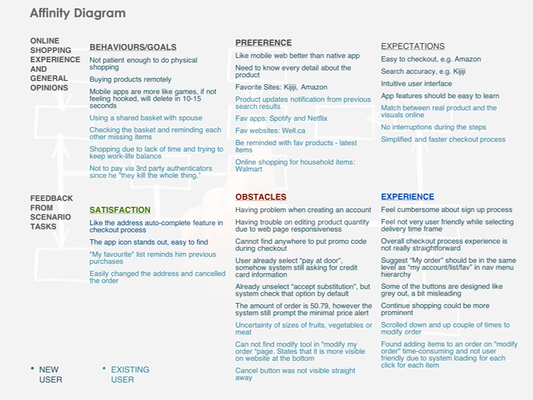
• to make "modify my order" process smoother
• to clearly specify the size of grocery items
• to improve the responsiveness issue of the app
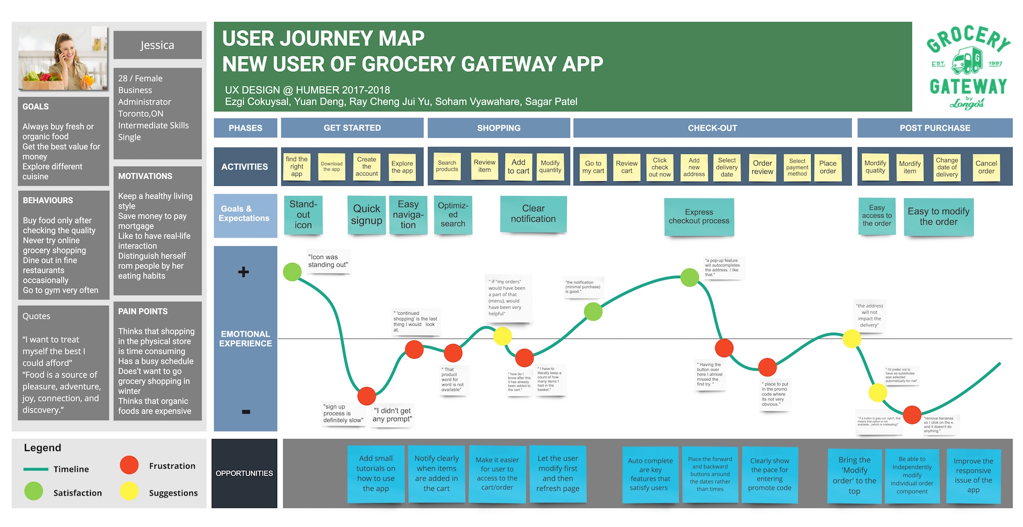
Among these top recommendations, we consider that giving users a better sense of the product size, making products more realistic is crucial to create a good initial experience for online-shopping. It is particularly true for the online-grocery shopping. Therefore, our ideation and prototyping will be focusing on solving the product size issue.
After group discussion, we all agreed that it won't be possible for user to perceive the correct size of the products when they are showing alone (without any visual reference). Therefore, the best way to indicate the size of a item is to place it in a context, which is familiar to ordinary people and can be easily understood.
First, by researching various online stores, we concluded that the body part (hand, body) would be a good way to provide reference for the item size.
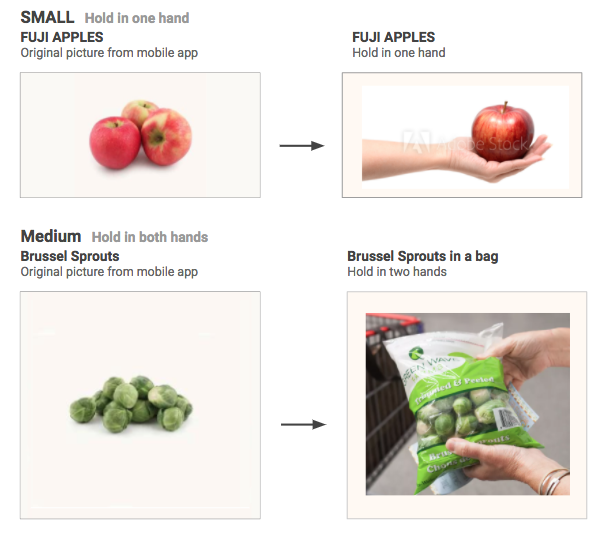
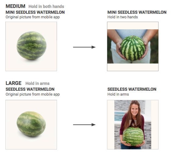
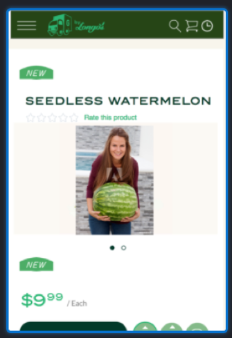
We chose to classify different product sizes into three main categories: small, medium, large. Small means the product can be hold in one hand, medium is sth needs to be hold in both hands, and large are those have to be hold in arms.
It is noted that the size is actually defined by the shipping size. In this case, although individual Brussel sprouts is small in size, when they are selling in a bag, we consider it as a medium size product. Therefore, showing two hands holding the shipping product, user can have a better sense of how many Brussel sprouts they will receive for one purchase.
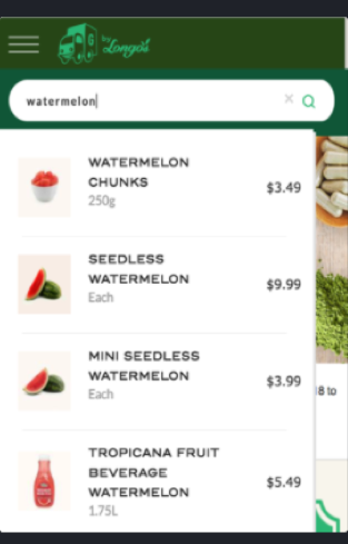
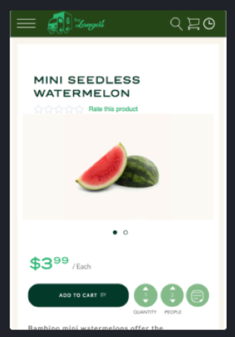
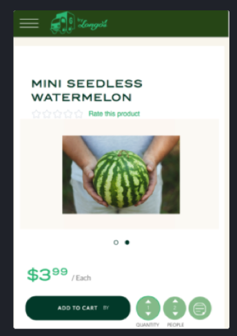
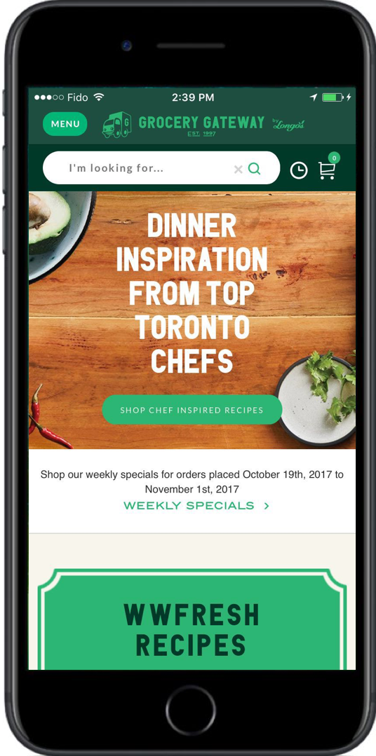
Next, we used inVision to wireframe our solutions in a context of Grocery Gateway mobile app.
Following images show the way how the Grocery Gateway app could present the watermelon along with a real people holding the watermelon as size reference.
Here is the link of the interactive prototype.